animation
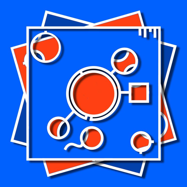
The design is basically a screen shot of an animated rotation of the top and middle layer of the composition. Other than color, the top and middle layers are identical. They have the same shapes and cutouts. When you view multiple versions, you can probably imagine just how the lower layer has rotated to the position you are seeing. I select four snapshots to create a quadriptych. That said, I also display individual stills from the animation
design
The images you are seeing on the web site are the result of several months of experimentation. In the current state I'm pretty satisfied with the design. I'm more than satisfied, I think it's great.
abstract art
I realize abstract art isn't for everyone, but having studied art history I have developed a real appreciation for certain styles of abstract art. That is, some abstract art, but not all. This work I created just feels right to me. It's non-representational with hints of abstraction illusionism. I intend it to be metaphorical, and I'll comment on that aspect of it below.
curiosity
I hope this tickles your curiosity. One hundred percent of the people I've shared this work with have had a spontaneous response something like 'wow that's interesting!' That's from people who don't have any particular interest in art, let alone abstract art, as well as those who are well versed in art history. Curiousity, the ability to stop and observe is at the root of art appreciation.
intention
I indicated earlier that I intend this abstract design, and the process of animating the top and middle layers as 'metaphorical.' What I mean by that is sometimes as I rotated the layers, I was just experimenting, not trying to get anything in particular. The results were happenstance. But other times, I became quite critical of the result of shifting a layer a few degrees left or right and seeing the result. This process was more purposseful. The metaphor is this: the layers sort of represent plans and randomness and how the outcome is unpredictable. Isn't that how our lives play out?
puzzle
Someone told me the design reminds them of a puzzle or puzzle pieces.
pepsi
There are some combinations of the layers in the so-called red, white, and blue 'Independence' series that remind people of the Pepsi logo. That's just coincidence.
rorschach ink blot
I realize some shapes in the design might be interpretated as representing objects, and looking at the design might feel a little like the rorschach ink blot psychology test.
Frank Stella
I'd have to say Frank Stella is my favorite abstract artist and his work may have influenced me in my design. I followed his career over 40 years from 'normal' flat canvas paintings to his three-dimensional sculptures. I could definitely imagine my designs morphing into three-dimensional works ala Stella.
squares
The reason the design is square, made up of layers of square-shaped forms is that the design has evolved from my earlier works in paper. I used to cut out shapes from five or six layers of paper, which I stacked to make a representational image of something (a butterfly, a logo, a version of an abstract work of art). I put the paper in CD trays for display. I liked how you could open the tray and take out the layers. Anyway, that was the genesis of what I'm doing now. Now I create work on a larger scale, often as born digital prints.
tiles
If you ever want to learn about an interesting niche of art history, look into the development of ceramic tile from various cultures. In some way my design can be construed to look like tiles, especially if I rotate the layers so that the outside edges line up to form a square.
plans
As I mentioned earlier, I feel like planning is a metaphor for these designs. That is you can plan events and outcomes, but there are things outside of your control that frustrate your plans. Frustration was part of my experience in trying to animate the layers of the design in a way that created an outcome that 'felt right' to me.
outlines
Outlines are almost dominating the shapes in my design. I found that I needed to add the outlines when it comes to printing. The outlines help separate the colors when the image is printed. There isn't always a high contrast between colors of the layers. Printed versions just didn't 'pop' the way I would have liked. I added outlines (see tiles, or Frank Stella).
container
One somewhat negative aspect of adding outlines was that the outline around the edge creates a sort of container for the elements inside. When I had a design without the outlines it didn't take on the aspect of a containter. I'll show some early versions of my designs on the website so you can see what I mean.
outer space
Admittedly, the circular shape in the middle with the three appendages (two circles and one square) may give some people an impression of a ship in outer space.
dashboard
The bars decorating one corner of the image might remind some people of a chart or some sort of status indicator.
scale
I'm told the square appendage coming off the central circle looks a little like it might be that base of a scale.
motion
Motion, either rotation of the layers or motion of the shapes in the design is a critical concept of the design. One might consider of the shapes in the design might change position. Do the smaller circles move in a way to 'link up' with the larger circle? Is the circle that has a squiggly line in motion?
snapshot
As I mention above, when you look at the design you are seeing a single frame of an animation where the layers are rotating.
paper
I do cut-out paper designs, but the prints are based on digitally manipulated layers. I apply digital effects of drop shadows and textures which make the design look like paper.
collage
Unlike collage, which is an additive process, the design is the result of subtracting from surface of a layer by cutting out or deleting sections of shapes. So, 'collage' is not the right term for this work.
chance vs choice
If you have read any of these notes you know the designs depict the conflict between results that happen by chance versus those that are based on a deliberate choice.
sperm
There is a shape in the design that seems to have a tail. It's definitely subject to interpretation. It could be a sperm, or maybe a virus -- some kind of life form. Maybe we are looking through microscope. But then what are the other objects?